
Best Practices for Designing SaaS Dashboards & Portals
This blog explores how to design SaaS dashboards and portals that are easy to use, visually clear, and tailored to different user needs improving both product adoption and customer satisfaction.
As more businesses move toward cloud-based software, the importance of creating intuitive, declarative, and efficient interfaces becomes essential. Research from Fortune Business Insights indicates this trend is only heating up, predicting the global SaaS market will hit USD 315.68 billion by the end of 2025. This underscores the stakes for SaaS companies to deliver frictionless digital experiences.
In this blog, we will take an in-depth look at SaaS portal & dashboard design best practices, investigating practical steps to forming interfaces that are effective and intuitive.
Why SaaS Dashboard & Portal Design Matter?
Drive user adoption and retention:
Properly designed dashboards and portals simplify the process and make software more interesting to use. Users who can immediately access the information or guidance are inclined to use the product for a longer duration.
Improve decision-making and efficiency:
An effective SaaS dashboard design displays important metrics and trends on a single screen, making it possible to take decisions, based on data, faster. By transforming raw data into concise visuals & summaries, dashboards turn information overload into actionable insights.
Reduce support costs:
A user-friendly portal/UI decreases the volume of tickets. By having customers able to search knowledge bases easily or make requests through a well-defined portal interface, support teams receive fewer redundant questions.
Enable scalability and flexibility:
SaaS tools in the modern era need to accommodate a variety of roles and data requirements. Highly personalized dashboards and configurable UIs make the experience unique for every user.
Make My Brand best practices include customizable dashboards and role-based views, allowing users to filter, rearrange, and personalize their experience according to workflow needs.
SaaS Dashboard Design Best Practices
An effective SaaS dashboard transforms complex data into actionable intelligence. It’s not just a visual layer it’s the control center of the user experience. When designed well, dashboards accelerate decision-making, reveal patterns, & build user trust. Here are the best practices that distinguish world-class SaaS dashboards from ordinary ones:
Prioritize Clarity Over Quantity
Information overload is the most common SaaS dashboard design mistakes. Dashboards should distill, not display, all available data. Begin by identifying 4–6 key performance indicators (KPIs) that drive the business or user’s workflow.
Use visual hierarchy to emphasize primary metrics while placing secondary data in expandable sections or tabs. As users scan first, interpret later, so every layout choice should reinforce quick comprehension.
Every visualization must have a different analytical purpose:
Trend analysis: line or area charts
Comparisons: bar or column charts
Distributions: histograms or scatter plots
Composition: donut or stacked charts (limited to few categories)
Do not use 3D effects, or excessive gradients. Data-ink ratio, a concept coined by Edward Tufte, applies strongly here: maximize the data, minimize the noise.
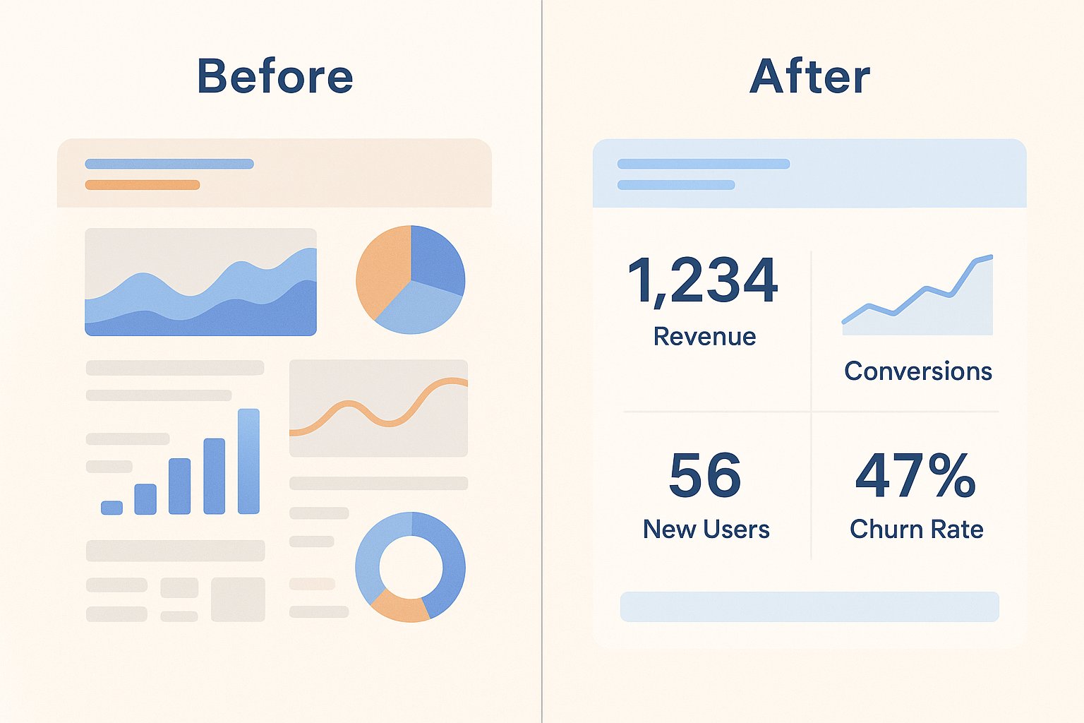
Visual hierarchy and Readability Design.
Arrange the elements to fit the eye patterns of the users such as the top left part to the most crucial metrics and the bottom right to details. Use whitespace strategically to segment content blocks, and maintain consistency in typography, spacing, and color codes.
Reserve accent colors like green for growth, red for decline only for significant changes. The objective: to empower a user to understand the health of the system in five seconds after scanning.
Optimize for Responsiveness and Performance
Since users are using dashboards on various devices such as widescreen monitors and mobile tables, SaaS dashboards should scale flawlessly among them. Make My Brand recommends responsive grids and vector-based graphics (SVGs) to ensure clarity on monitors, tablets, and mobile devices.
Enable Customization and Role-Based Views
Not all users interpret data in the same way. The product managers, analysts, and executives concentrate on various measures. Ensure customizable layouts, date ranges, and the ability to select the various widgets to enable personalization of the dashboards to workflows.
Provide Context, Not Just Numbers
Numbers without explanation create confusion. Incorporate microcopy, tooltips, & comparison baselines to frame insights. Provide drill-down trails for more detailed exploration but remain clear at the summarizing level. Every data point must be able to answer the fundamental user question: “What does this mean for me?”
Test, Measure, Iterate
Finally, validate your SaaS dashboard designs with actual users early and often. Not all pain points can be identified with the use of analytics. Conduct usability tests or surveys to ensure that your hierarchy of information is equally related to the priorities of the users.
Incorporate feedback quickly. Monitor usage patterns after launch: in case some of the charts are not used or misinterpreted, reiterate them.
Portal UI Design Best Practices
A SaaS customer or support portal has a different focus. Still, many of the same UX principles apply. Here are key guidelines for portal UI design:
Maintain Brand Consistency
Your portal should feel like a natural extension of your main SaaS product, not an isolated module. Make My Brand consistently applies branding principles across color palettes, typography, and component behavior, reinforcing trust and professionalism.
Customers will have more confidence in a platform that has a consistent visual identity across all touchpoints. Consequently, harmonious X-factor branding of the product, portal and support environment adds value to user experience.
Simplify Navigation
One of the leading causes of frustration amongst users is poor navigation. Best practices to solve that include:
Group related functions (Billing, Tickets, Docs) under plain-language labels
Use a fixed header or sidebar to maintain orientation
Provide breadcrumbs or contextual links
Offer a prominent, always-visible search bar
Prioritize Self-Service
Modern SaaS users expect instant answers. According to Zendesk, 67% of customers prefer self-service over a company representative. A robust portal must deliver:
Contextual, predictive search across articles, tickets, and documentation
AI-powered recommendations or auto-suggest as users' type
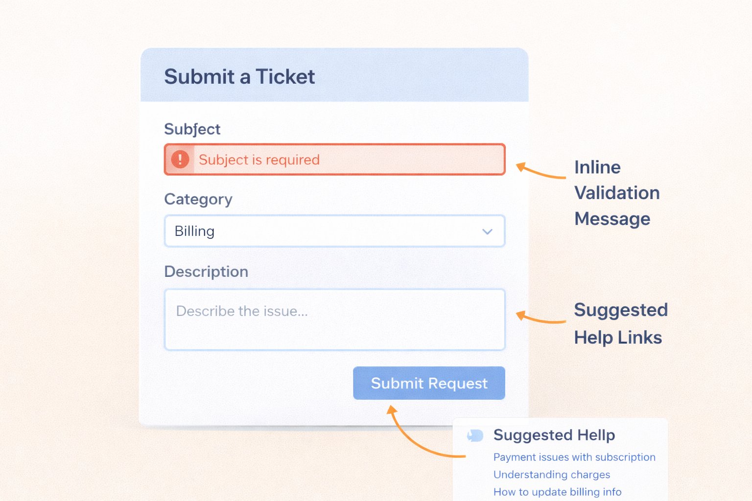
Suggested FAQ or article links embedded in ticket forms
These features reduce friction and deflect support cost.
Optimize Forms and Workflows
Ticket submission needs to be frictionless. Smart defaults, inline validation, and contextual help can minimize errors.
When users must escalate to human support, the form itself should not be a barrier. A few guiding principles:
Use concise, intuitive fields with inline validation
Auto-suggest categories or prompt users with smart defaults
Show related self-help articles while the user types
Minimize the number of steps and clicks
Design for Mobile and Accessibility
More users access SaaS tools from mobile devices or under constrained conditions. Portals must perform flawlessly across devices. Use responsive design and adhere to WCAG 2.1 accessibility standards for inclusivity and compliance.
Offer Transparency Through Real-Time Insights
Your portal can double as a mini dashboard for account health: ticket statuses, pending actions, usage alerts, billing summaries.
Display statuses like “Pending Response,” “Awaiting Feedback” or “Due in 7 Days”, with visual indicators (icons, color codes). Transparent interfaces reduce the need for users to chase updates.
Embed Feedback and Continuous Improvement
To evolve the portal, collect real-time feedback:
“Was this article helpful?” prompts
Micro-surveys after support interactions
Open comment boxes
Usage analytics (which pages are visited, where users drop off)
Top SaaS platforms maintain quarterly UX reviews driven by feedback metrics. This continuous iteration ensures the portal remains aligned with evolving user needs.
Balance Security and Usability
Security is non-negotiable, yet convenience matters. Implement:
Single Sign-On (SSO) when possible (reducing login overhead)
Multi-Factor Authentication (MFA) for high-risk actions
Clear login flows: progress indicators, recovery paths
Iterate with Data and Testing
A portal must be treated as a living interface. Use:
Heatmaps & session recordings to find pain zones
Funnel analytics to measure drop-offs
A/B testing to evaluate navigation, wording, or layout tweaks
Our Expert Opinion
Prioritize clarity and context over flashy visuals, highlighting the metrics that matter most. By presenting actionable insights upfront and allowing deeper exploration on demand, your dashboard empowers users to act confidently and efficiently, turning data into real business impact.
SaaS UX Best Practices: Beyond Dashboards and Portals
Dashboards and portals are central to any SaaS platform, but superior UX is brought by advanced and comprehensive design principles that can improve usability, adoption, and retention to every interaction point.
User-Centered Research
An excellent UX design is based on research and not assumptions. Carry out structured user interviews, behavioral analytics and heat map analysis to find areas of friction.
Track event data to uncover underutilized dashboard modules or high-exit workflows. Apply these insights and make continuous design refinements where product designs are made to meet actual user requirements and not the assumptions made internally.
Onboarding and Contextual Assistance
In the case of complex SaaS ecosystems, first impressions are characterized by onboarding. Implement progressive onboarding and context-aware help systems that guide users based on behavior and lifecycle stage.
Techniques such as in-app tours, guided checklists, and contextual tooltips reduce cognitive load and accelerate feature adoption.
Consistency Across Interfaces
Consistency enhances predictability, a cornerstone of intuitive UX. Maintain uniform interaction patterns, button hierarchies, and terminology across dashboards, forms, and settings. A logical system of visuals reduces the amount of learning required and is an indication of design maturity.
Performance Matters
Fast load times and smooth interactions are part of SaaS UX best practices. Use techniques like data caching, pagination, or asynchronous loading for heavy content. Compress images and minimize server requests.
As an example, the gaming company in McKinsey’s study saw a 25% revenue increase from a minor usability change. Imagine the gains from optimizing load speeds or reducing latency.
Measure and Iterate Continuously
Define quantifiable UX KPIs such as task completion rate, time-on-task, & NPS and monitor post-launch.
Conduct A/B tests for new layouts or workflows. Meanwhile, UX must be regarded as a continuous process of optimization and not deliverable. Sustained iteration keeps the experience adaptive and user centric.
SaaS Dashboard and Portal Design: A Quick Comparison
Dashboards and portals have different purposes in the UX of SaaS, despite the similarity in terms of usage.
Aspect | SaaS Dashboard | SaaS Portal |
Purpose | Presents real-time data, analytics, and KPIs for quick decision-making. | Acts as a user gateway for account management, support, and documentation. |
Primary Users | Operational teams, analysts, and executives. | End users, customers, partners. |
Core Focus | Data visualization, insights, and performance tracking. | Task execution, communication, and self-service. |
Design Priority | Clarity, hierarchy, and visual accuracy. | Accessibility, navigation flow, and user guidance. |
Interaction Type | Data-driven (filters, graphs, metrics). | Action-driven (forms, tickets, uploads). |
Frequency of Use | High, often daily, or hourly. | Moderate, used as needed for support or configuration. |
In essence, dashboards help users understand performance, while portals help them act on it.
Conclusion
Developing intuitive SaaS dashboards and portals requires a perfect blend of usability, simplicity, and empathy for users. The return on investment is obvious: effectively designed SaaS products get picked up at higher rates, need fewer support calls, and gain stronger customer loyalty. By following these best practices from visual simplicity and responsive design to simple portal workflows, tech companies can create interfaces people trust and like. Investing in thoughtful dashboard UI/UX and portal UI design transforms raw data and support functions into seamless, user-driven experiences.
Ready to Elevate Your SaaS Experience? Connect with MMB to turn data and design into measurable growth.
Loading FAQs
Please wait while we fetch the questions...
Published on October 22, 2025 by Khushpreet Kaur