
Top UI/UX Mistakes That Are Killing Conversions
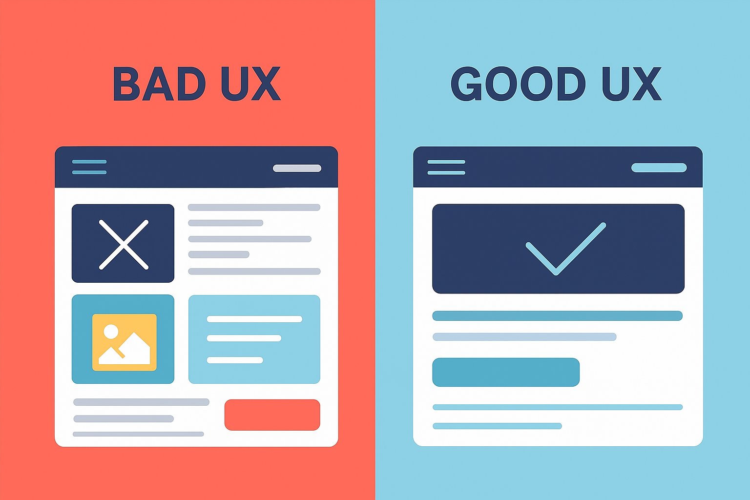
Good UI/UX design is key to turning website traffic into conversions. The blog highlights common mistakes like slow speed, cluttered layouts, poor CTAs, and weak mobile design that hurt performance—and explains how optimizing usability, clarity, and trust can boost engagement and sales.
Getting people to land on your website is hard enough. You’ve invested in ads, SEO, social campaigns, maybe even influencer shoutouts. The traffic is there, but here’s the painful truth: traffic doesn’t pay the bills. Conversions do.
And far too often, visitors click away without taking action, not because your product isn’t good, but because your website quietly sabotages itself. The culprit? UI/UX mistakes.
The smallest friction in design or functionality can make users drop off, leaving revenue on the table. To learn about the importance of good UI/UX for growth and most common mistakes that kill conversions that you might be making, keep reading.
Why Good UI/UX Matters for Conversion Optimization?
Great UI (user interface) and UX (user experience) are the backbone of conversion optimization. Here’s why:
First impressions decide everything.
People judge your site in less than a second. If it looks messy or hard to use, they won’t hang around.
Friction kills momentum.
Every click, scroll, and interaction should feel effortless. If users have to think too hard, they leave.
Trust is a must.
A well-designed, user-friendly site signals credibility. If your UX feels broken, users assume your product/service is too.
Excellent UI/UX makes the path to purchase intuitive, fast, and friction-free. Bad UI/UX does the opposite and that’s where most businesses unknowingly shoot themselves in the foot.
11 UI/UX Mistakes That Might Be Killing Your Conversions
Let’s get real about the traps many businesses fall into. If any of these sound familiar, it might be time for a serious UI/UX checkup.
Slow Load Speed
Almost 40% of the users look for competitors if it takes your website more than 3 seconds to load. Google asks businesses to aim for under 2.5 seconds for core web vitals. Slow websites frustrate users, and slow checkout leads to customers with high intent of purchase to leave the website.
Fix Close Speed By:
Compressing images and serving them in next-gen formats like WebP/AVIF.
Use a content delivery network (CDN) to serve assets faster worldwide.
Minimize JavaScript and CSS bloat.
Monitor speed performance with tools like Google PageSpeed Insights or GTmetrix.
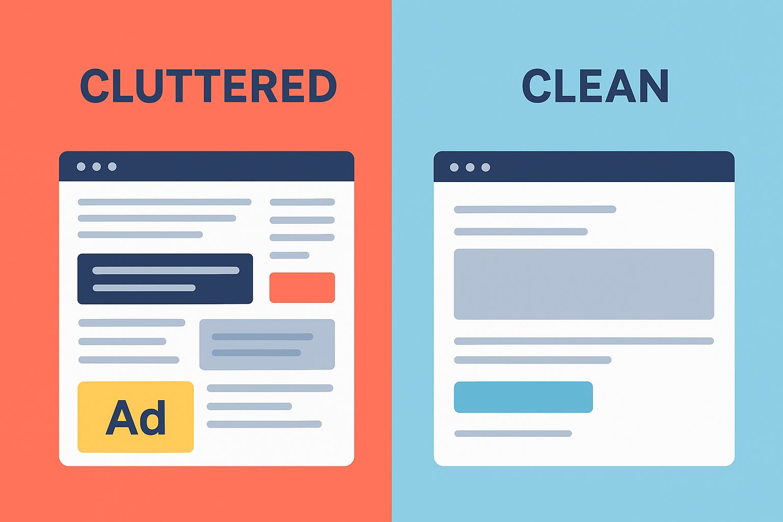
Cluttered Layouts
If everything screams for attention, nothing gets attention. Cognitive overload makes users leave. Users typically scan in F-patterns or Z-patterns, and clutter breaks these natural flows.
Solutions:
Keep one clear focal point per page.
Use white space strategically to separate content.
Stick to 2–3 font sizes and a consistent color palette.
Apply the “one goal per page” rule.
Unclear Value Proposition
Visitors shouldn’t need more than 5 seconds to know what you do, why it matters, and why they should trust you. Without a strong value proposition, users don’t have a reason to stay or act.
Solutions:
Place your value proposition above the fold.
Use clear, benefit-driven headlines and not jargon.
Highlight your USP (unique selling proposition) with simple visuals.
Confusing Navigation
Consider your navigation a failure if the users cannot find what they’re looking for in 3 clicks. As these navigation User interface and user experience errors increase bounce rates and reduce conversions, especially on e-commerce sites where product findability is crucial.
Solutions:
Keep menus shallow and avoid more than 2 levels deep.
Use descriptive labels like “Pricing” instead of Resources.
Add a persistent search bar with autocomplete.
Include breadcrumbs for easy backtracking.
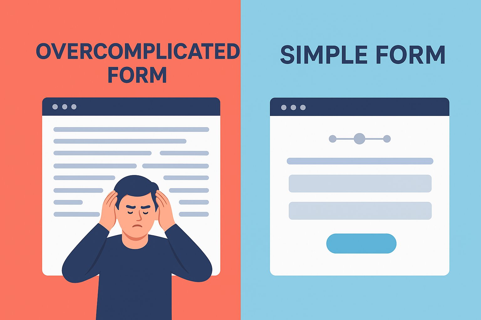
Overcomplicated Forms
Conversion forms with too many fields kill leads. Studies show reducing fields from 11 to 4 can increase conversions by 120%. Every extra field increases friction and drop-offs.
Solutions:
Collect only essentials like name and email for lead generation.
Use autofill and inline validation.
Break long forms into multi-step wizards for better usability.
Offer alternatives like Google/Apple login.
Poor Mobile Experience
Mobile accounts for over 60% of global web traffic. If your site isn’t optimized, you’re alienating the majority. Google’s mobile-first indexing means a poor mobile UX hurts SEO and conversions.
Solutions:
Design mobile-first, desktop-second.
Use larger tap targets (min. 48px by 48px).
Ensure font sizes are readable at least 16px body text.
Test on multiple devices and screen sizes.
Weak Call-to-Actions (CTAs)
CTAs like “Submit” or “Click Here” don’t persuade. The CTA is your conversion trigger. A strong CTA can lift conversions by up to 202%.
Solutions:
Use action-driven, benefit-oriented language like “Get My Free Demo”.
Create visual contrast with bold colors.
Place CTAs strategically such as keeping them above the fold and after key value sections.
Test CTA wording, size, and placement with A/B testing.
Distracting Pop-Ups
Pop-ups that block content immediately or appear too often frustrate users. Bad pop-ups tank engagement and damage brand perception.
Solutions:
Use pop-ups sparingly and trigger them by user intent like scroll depth, exit intent, or time-on-site.
Make closing them easy and obvious.
Ensure they’re mobile-friendly as Google penalizes intrusive mobile pop-ups.
Inconsistent Design
If colors, fonts, or button styles change across pages, it feels unprofessional. Inconsistency reduces trust and increases cognitive load.
Solutions:
Create and stick to a UI style guide.
Use consistent branding elements across the site.
Standardize CTA button colors and placements.
Audit pages regularly for inconsistencies.
Ignoring Social Proof
No reviews, testimonials, or case studies on your webpage leads to no trust. 92% of people check reviews before buying. Social proof reduces uncertainty and builds confidence.
Solutions:
Display testimonials with real names, photos, or company logos.
Use case studies for B2B credibility.
Highlight user stats such as “Trusted by 10,000+ customers”.
Showcase trust badges (secure checkout, partner logos).
Forgetting the “Empty States”
Pages like “Nil results” or “Your cart is empty” often feel like dead ends. Empty states are opportunities to guide users.
Solutions:
Add friendly microcopy, e.g., “No results, try a different keyword”.
Suggest alternative products or popular items.
Add a CTA to keep users exploring such as “Browse Bestsellers”.
These User interface and user experience errors will lead your potential customers to your competitors.
Conclusion: Don’t Let Bad UX Drain Your Growth
UI/UX isn’t just design, it’s revenue. Every small friction point compounds and leads to lost conversions. While some mistakes are obvious, many slip under the radar until someone points them out.
That’s where we come in. At Make My Brand, we specialize in spotting these silent UI/UX mistakes that are conversion killers and take appropriate measures to assist your growth. We audit, optimize, and fine-tune your site so more visitors actually take action.
If you are struggling with few visitors and even fewer conversions, your website might be guilty of some of these mistakes. So, if you just want to squeeze more value out of your traffic, get in touch with us. Let’s turn those clicks into conversions.
Loading FAQs
Please wait while we fetch the questions...
Published on October 30, 2025 by Khushpreet Kaur