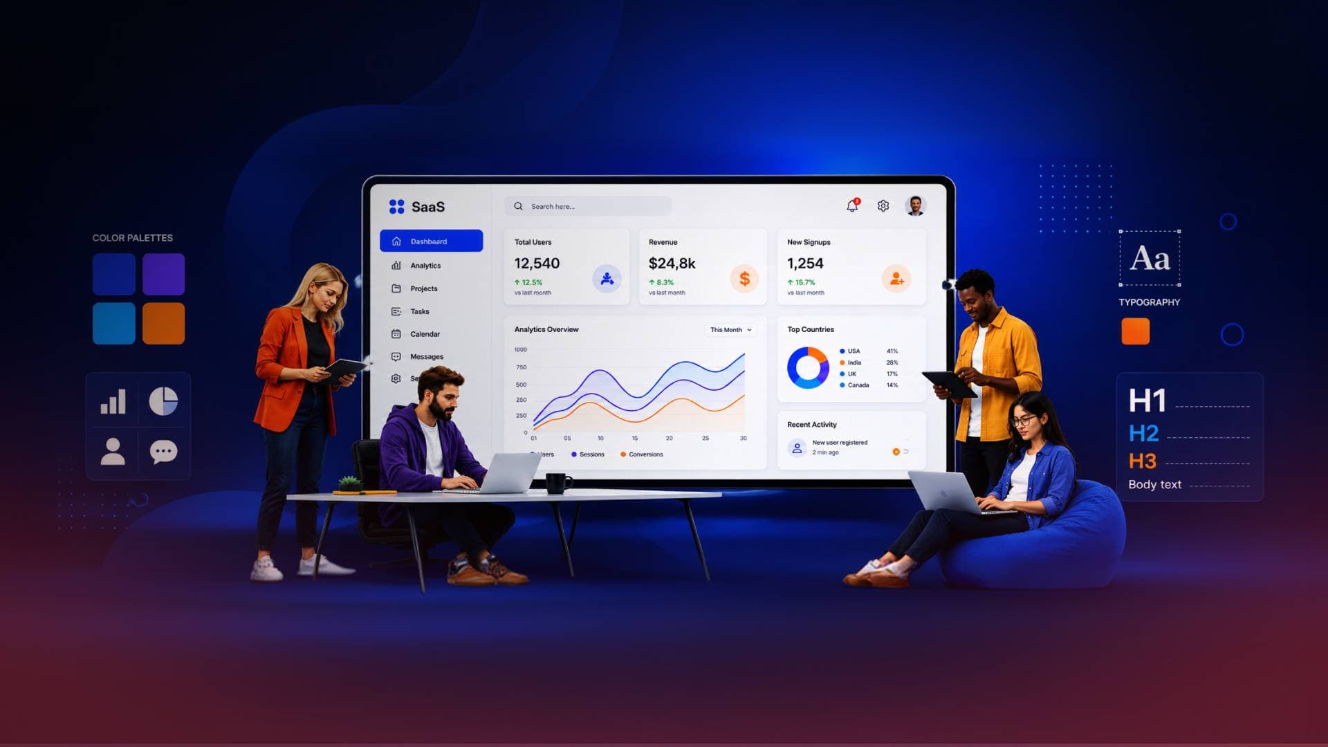
Graphic Design for SaaS Startups: Building Visual Systems That Improve Conversion and Growth
Graphic design for SaaS startups goes beyond aesthetics. Discover how scalable visual systems, cohesive branding, high-converting landing pages, UX psychology, data storytelling, and AI-assisted workflows can improve conversions, reduce friction, and accelerate sustainable SaaS growth.
Most SaaS companies focus heavily on code, features, and core infrastructure, treating visual presentation as a secondary task. In a crowded market, strong visual clarity and seamless user experience serve as critical factors in whether a software succeeds. High-performing tech companies do not view design as decoration, they build scalable systems that convert traffic, lower drop-offs, and establish market authority.
Strategic graphic design for SaaS startups bridges the gap between complex engineering and user-facing visual strategy. By transforming technical features into intuitive interface layouts, design moves beyond simple aesthetics to guide visitors seamlessly into active trial users and drive measurable product activation.
The New Strategic Role of Visual Communication in SaaS Growth
Visual design in the software environment has evolved far beyond superficial color palettes and surface aesthetics. Today, it acts as the critical interface between intricate backend engineering and the end user’s daily workflow.
When potential clients encounter a digital touchpoint, they instantly evaluate platform security, system performance, and operational competence based on visual cues. Executing purposeful graphic design for SaaS startups builds immediate market authority.
Early-stage teams frequently build powerful features but struggle to translate technical complexity into clear value propositions. Leading category creators such as Stripe, Linear, and Notion achieved massive market traction in large part because their design execution communicated enterprise grade quality from their very first release.
When marketing assets and core software interfaces maintain precise visual alignment, user cognitive load drops. Human brains process visual structures far faster than long form documentation.
A poorly executed layout can prompt visitors to exit instantly without a second thought, leaving a lasting negative impression on the business. Research indicates that 38% of users will stop engaging with a website if the layout or design is unattractive.
In an increasingly crowded software market, user conversion efficiency becomes an urgent operational priority. By deploying structured visual systems early, software companies eliminate onboarding friction, accelerate sales velocity, and build durable, high converting digital assets.
When building a complete web experience, early stage ventures lean on specialized graphic design services. Modern startups need scalable design frameworks that align brand positioning across marketing pages, onboarding steps, and product screens.
At Make My Brand, this balance is executed through the proprietary Brand Development Lifecycle (BDLC) framework, embedding design precision directly into growth strategy.
Architectural Foundations: Proprietary Visual Systems and Identity
A resilient visual identity forms the bedrock of modern software positioning. Unlike static consumer brands, digital products span dynamic environments, high converting web pages, interactive product dashboards, automated email systems, mobile applications, and technical documentation.
Brand fragmentation occurs when these touchpoints look disconnected, subtly eroding buyer confidence.
Core Architecture of Modern Product Branding
Proprietary Asset Libraries
Relying on generic open source icon sets or stock graphics dilutes visual distinction. Leading startups create custom icon frameworks and proprietary illustration styles that prospects instantly associate with a single brand.
Component-Based UI & Marketing Systems
Building standardized visual design tokens bridges marketing landing pages with internal product interfaces. This keeps the design consistent as new product features roll out.
Design for Accessibility
Accessibility is shifting from basic compliance to a strategic growth advantage. Accessible contrast ratios, clear typographic hierarchies, and legible data visualizations widen market reach and improve overall usability.
Motion Design Systems
Micro-animations and functional motion graphics act as interactive explainer tools. Subtle transitions signal state changes, guide feature discovery, and make software feel responsive.
When developing scalable brand infrastructure, the team at Make My Brand aligns custom visual assets directly with underlying user acquisition funnels. Building design systems that connect marketing and product engineering allows growing software platforms to scale their digital footprint cleanly without design debt.
Building Trust Through Cohesive Visual Languages
Color Hierarchy and Focus
Strategic color use directs eye movement toward primary actions while establishing stability.
Screen-Optimized Typography
Readable fonts improve data clarity across complex dashboards and mobile displays.
Design Systems and Tokenization
Reusable component libraries keep styling consistent, allowing development teams to release updates faster.
When every image, icon, and screen communicates purpose, user acquisition costs decrease and customer retention improves.
Engineering High Converting Landing Pages for Software Products
A high converting landing page functions as the main engine for user acquisition, converting casual visitors into active trial users. Layout balance, space, and interactive cues control whether a visitor signs up or leaves.
Anatomy of a High-Converting SaaS Hero Section
Hero Element | Purpose | Best Practice |
|---|---|---|
Value-Driven Headline | Communicates the core benefit instantly | Focus on outcomes, not features |
Product Preview | Demonstrates the product in action | Use real UI, interactive demos, or short product videos instead of generic illustrations |
Primary CTA | Encourages immediate action | Make Free Trial or Start for Free the dominant CTA |
Secondary CTA | Serves high-intent buyers | Offer Book a Demo or Watch a Demo as a secondary option |
Social Proof | Builds credibility and reduces hesitation | Place customer logos, testimonials, G2 ratings, or enterprise badges close to the CTA |
Structuring a high converting landing page demands careful orchestration of spatial layout, visual contrast, and value presentation.
Critical Elements of High-Performance Product Pages
Immediate Product-Led Clarity
Visitors must grasp what the software does within three seconds. Substituting abstract imagery with crisp, interactive product previews instantly anchors expectations.
Modular Layout Systems
Transitioning from custom one-off campaign builds to modular visual design systems lets growth teams deploy fresh, high-performing landing pages in days instead of weeks.
Data Storytelling Visuals
Complex SaaS metrics and analytics dashboards are simplified through custom charts and infographics, making technical benefits digestible at a glance.
Frictionless Action Focus
Removing visual clutter, redundant navigation links, and competing CTAs focuses visitor attention directly on the primary conversion event.
Executing this level of visual precision requires close alignment between creative strategy and technical performance. When speed to market is critical, software companies often struggle to bridge the gap between static design layouts and production-ready code. At Make My Brand, this friction is eliminated by integrating visual storytelling directly into agile development workflows, ensuring every landing page component is engineered for fast load speeds, responsiveness, and maximum trial conversion.
Behavioral Psychology: Applying Neuromarketing and UX Frameworks
The most memorable software experiences apply cognitive psychology to guide decision-making naturally. Integrating neuromarketing principles allows growth teams to construct visual environments aligned with natural human perception and cognitive processing. Applying human-centered design ensures that visual polish serves actual user needs rather than superficial trends.
Design Metric Focus | Operational Business Outcome |
|---|---|
Clear Spatial Hierarchy | Lower Bounce Rates & Higher Sign-ups |
Context-Aware Product Graphics | Reduced Onboarding Time-to-Value |
Cohesive Cross-Platform Identity | Stronger Long-Term Brand Recall |
Leveraging cognitive dynamics removes unnecessary friction from the user journey:
Visual Directional Vectors
Human eyes naturally follow directional cues, screen lines, and spatial paths. Structuring core sign-up forms along these natural visual vectors boosts engagement rates.
Hick’s Law Optimization
Overwhelming users with options increases decision latency. Visual interfaces must group complex features into clear, scannable visual modules.
Fitts’s Law Implementation
Essential action elements such as "Start Free Trial" or "Book Demo" must feature dominant visual weight and generous hit areas to ensure instant interaction.
Strategic Contrast Hierarchies
High-contrast visual focal points ensure secondary navigational elements never compete with primary conversion goals.
When software products reduce data visualization complexity and streamline user onboarding, user churn drops while product-led growth accelerates.
Emerging Design Practices in Modern SaaS
SaaS design standards evolve rapidly. Startups adopting updated visual frameworks build stronger market presence than those relying on outdated templates.
Modern Visual Execution Strategies
Proprietary Icon Libraries
Custom iconography replaces generic stock packages, giving product dashboards an exclusive, polished feel.
Signature Illustration & Motion Systems
Consistent animation patterns act as functional explainer tools, guiding users through complex workflows instead of serving purely decorative roles.
Data Storytelling in Dashboards
Custom chart styles, report formats, and clean data visualizations turn complex analytics into clear insights while matching brand identity.
Accessible and Adaptable Graphics
Contrast-checked visuals ensure usability across lighting environments and devices, while contextual graphics adjust based on live product state.
By using modular visual architectures, tech companies scale marketing pages and internal product views without compromising visual quality.
AI Workflows and the Future of Software Visuals
Rapid advancements in artificial intelligence are reshaping how digital visuals are produced, managed, and rendered across user touchpoints.
AI-Assisted Workflows with Human Refinement
Startups increasingly utilize AI tools to accelerate design exploration and asset generation. However, high-growth software brands apply strict human refinement to preserve visual uniqueness and avoid the generic look typical of raw AI outputs.
Dynamic, Context-Aware Visual Assets
Static UI screens are giving way to dynamic graphics that adapt to user behavior, account roles, or live product states. Showing personalized, context-aware visual views during user onboarding increases relevance and drives activation.
Visual Optimization for AI Discovery
As users shift toward AI answer engines and automated copilots for software evaluation, structured diagrams, custom data graphics, and clear interface visuals play an increasing role in brand discoverability across digital ecosystems.
Execution Models: Specialized Agency Expertise vs. In-House Teams
As software platforms scale from MVP validation to market expansion, leadership teams face a structural choice - expand internal product design teams or partner with specialized external experts.
Internal product designers excel at day-to-day feature iteration but establishing foundational visual identity systems and high-converting marketing creative often benefits from focused external capability.
Strategic Dimension | In-House Product Team | Specialized Growth Agency |
|---|---|---|
Core Expertise | Feature UX & Iteration | Strategic Visual Systems |
Launch Speed | Dependent on Sprints | Immediate Turnaround |
Scalability | Fixed Capacity | Rapid Flexible Scaling |
Leveraging professional graphic design services and user experience services helps SaaS startups establish brand authority without distracting core engineering talent. By deploying unified visual strategy frameworks, the team at Make My Brand equips software platforms to present enterprise-ready visual presence from day one.
Investing in systematic graphic design for SaaS startups reduces customer acquisition costs, speeds up onboarding time-to-value, and builds long-term enterprise value.
Conclusion
Memorable digital products are built where clarity, psychological strategy, and functional engineering converge. Visual design is not a decorative add-on it is a critical driver of customer retention, acquisition efficiency, and long-term brand equity. Software platforms that embed human-centered visual strategy into their growth model consistently outperform competitors relying on features alone. Aligning your platform’s visual footprint with clear user expectations builds a lasting digital brand that scales seamlessly across markets.
Loading FAQs
Please wait while we fetch the questions...
Published on August 11, 2026 by Abhishek Vasudev