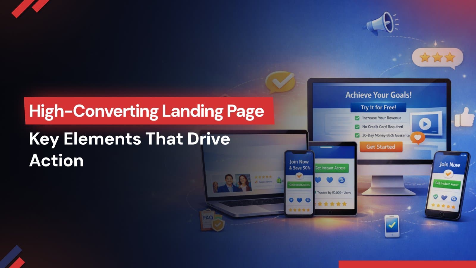
High-Converting Landing Page: Essential Features That Drive Action
A high-converting landing page is engineered for action. From intent-driven copy and trust signals to speed, CRO, and AI personalization, this guide reveals how Make My Brand transforms landing pages into performance assets that reduce friction, boost engagement, and drive measurable conversions.
A landing page is more than a digital touchpoint - it is the decisive moment where interest turns into action. Yet, industry research shows that the average landing page converts only 5–6% of visitors, while top-performing pages exceed 10%.
The difference isn’t traffic. It’s precision.
A high-converting landing page is engineered, where every headline, visual, CTA, and millisecond of load time is intentionally optimized.
At Make My Brand, this performance-first approach has delivered a measurable impact. In one recent engagement, geo-targeted, mobile-first landing pages achieved 45% faster load times, significantly reducing bounce rates and increasing user engagement-demonstrating how landing page strategy optimization directly improves performance.
So, what truly separates an average page from one that consistently converts?
Below, we break down the essential features for a high-converting landing page - backed by data and refined through experience.
Clear, Persuasive Headlines and Copy
Visitors decide in milliseconds whether to stay or leave - research shows first impressions are formed in as little as 0.05 seconds. That makes your headline one of the most valuable assets on a high-converting landing page.
Lead with a Benefit, Not a Description
A powerful headline should instantly communicate:
What problem is being solved?
What outcome can be expected?
Why is this solution different?
Precision matters. Clarity outperforms cleverness - every time.
Reinforce with Focused, Outcome-Driven Copy
Once the headline captures attention, the supporting copy must sustain it. Keep it:
Concise
Value-focused
Structured for skimming
Use bullet points to highlight key benefits.
Landing pages that align copy with user intent consistently perform better. According to HubSpot research, pages that convey positive emotion and directly address visitor concerns generate stronger engagement and higher conversions.
Address Objections Before They Surface
Uncertainty is one of the biggest conversion barriers. Strong landing pages optimization proactively reduces friction by:
Including privacy assurances
Clarifying commitments (e.g., no long-term contracts)
Reinforcing guarantees or security standards
In fact, addressing customer fears directly has increased signups by up to 80%.
Design a Single, High-Impact Call-to-Action
Even compelling messaging falls short without a clear next step. Effective CTAs are:
Action-oriented (“Get My Proposal,” “Start My Trial”)
Written in first person for ownership
Visually prominent with contrast and whitespace
Personalized CTAs convert 202% better than generic ones.
Equally important is restraint. Landing pages with one clear CTA convert better compared to pages cluttered with multiple offers.
The principle is simple: One page. One promise. One action.
When headlines, copy, and CTAs work in alignment, they transform attention into measurable conversion - the defining characteristic of a truly high-converting landing page.
Engaging Visuals and Media
A high-converting landing page is not text-heavy - it is visually strategic. The human brain processes images significantly faster than words, which means visuals often determine whether a visitor stays long enough to read.
1. Use Video to Accelerate Understanding
Video is no longer optional in performance-driven landing pages.
38.6% of marketers identify video as the most important element for driving conversions.
93% of marketers report strong ROI from video content.
A short hero video placed above the fold - ideally under 60–90 seconds and captioned – can immediately clarify your value proposition. The key is balance: engaging without compromising page speed.
When done correctly, video shortens the decision cycle by answering questions before they are asked.
2. Show the Product in Context
Static logos do not convert - experiences do. High-resolution images, mockups, or interface previews help visitors visualize outcomes. Consider:
Before-and-after comparisons
Product-in-use visuals
Service workflow illustrations
Infographics explaining results
Visual storytelling bridges the gap between promise and proof.
3. Turn Social Proof into Visual Assets
Trust influences conversion more than persuasion alone. Research shows that 50% of consumers trust online reviews when making purchase decisions. Visually embedding trust signals increases credibility instantly. Effective visual trust elements include:
Customer testimonials with photos
Star ratings or review snippets
Recognizable client logos
Industry certifications
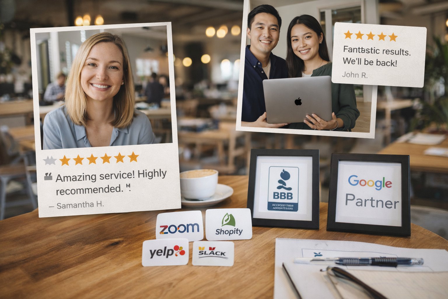
Notably, even adding a well-placed testimonial has increased conversions by approximately 34%.
Visual proof reassures visitors that others have already made - and benefited from - the decision.
4. Design for Focus, Not Decoration
Conversion design tips should guide attention - not compete for it. To improve clarity and engagement:
Remove unnecessary navigation links
Limit external distractions
Use generous white space to enhance visual hierarchy in graphic design
Keep the primary CTA visible above the fold
Most visitors scan in an “F-pattern,” focusing on the top and left side first. Place your strongest value statements and CTAs in those visual hotspots.
For longer pages, structure content using:
Clear subheadings
Icon-supported benefit sections
Visual contrast between sections
The objective is simple: make the page effortless to scan while compelling enough to read.
In a high-converting landing page, visuals are not decorative - they are strategic conversion tools. When video, imagery, layout, and social proof work together, they reduce friction, build trust, and move visitors toward confident action.
Social Proof and Trust Signals
No matter how compelling the offer, conversion ultimately depends on one factor: trust.
A high-converting landing page reduces uncertainty before it asks for commitment. When credibility is visible, hesitation decreases - and action increases.
Why Trust Matters
91% of consumers trust online reviews as much as personal recommendations.
Yet, nearly 77% of landing pages fail to include strong social proof.
This gap represents a significant missed opportunity.
1. Add Immediate Social Validation
Visitors look for confirmation that others have already taken - and benefited from - the same decision. Effective trust elements include:
Customer testimonials (with names and photos)
Star ratings or review excerpts
Recognizable client logos
Industry awards or certifications
Social proof reduces perceived risk. And reduced risk accelerates decision-making.
2. Display Security and Reliability Signals
Particularly for e-commerce, SaaS, or lead generation pages, trust seals matter. Position security assurances near the CTA, such as:
SSL certificates
Secure checkout badges
Data privacy statements
“No commitment” or “Cancel anytime” messaging
Additionally, reinforce reliability with measurable proof points:
“99.9% uptime”
“85% customer satisfaction rate”
“10,000+ clients served”
Specific numbers are more persuasive than generic claims.
3. Make Trust Visible - Not Hidden
Trust signals should not be buried in the footer. Place them:
Near the primary CTA
Alongside forms
Strategically within the decision-making flow
Even subtle reinforcement - like a third-party review snippet or a short case study highlight - strengthens credibility.
At Make My Brand, trust-building is integrated into a conversion strategy. In recent projects, landing pages designed with explicit trust cues and consistent brand presentation reduced user drop-off by 25%, reinforcing how psychological reassurance directly impacts performance.
The Strategic Advantage of Credibility
Trust is not decorative - it is foundational. When visitors see proof, security, and validation upfront, they stay longer, engage deeper, and convert with greater confidence.
On a high-converting landing page, credibility is not assumed. It is demonstrated.
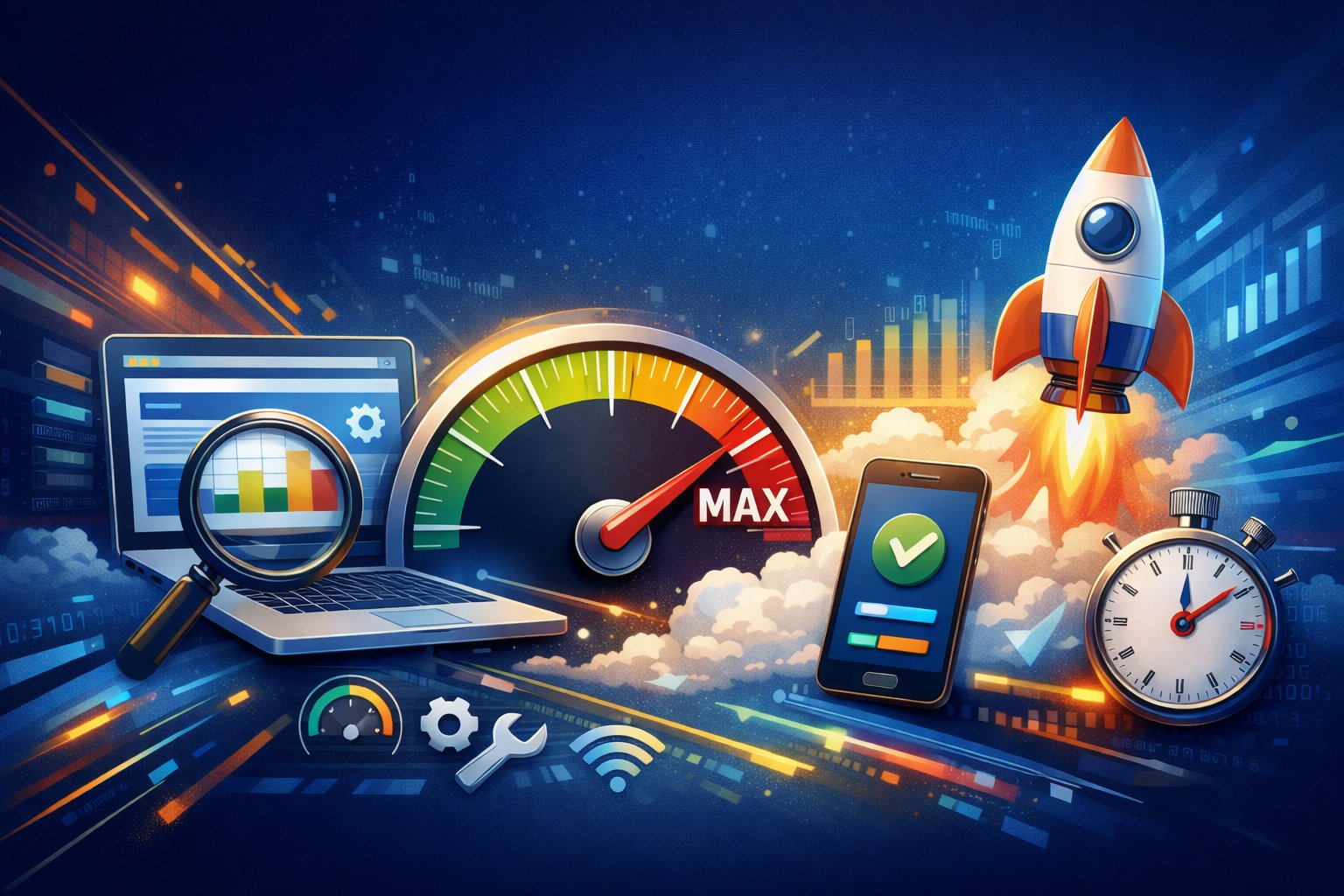
Technical Performance and Speed
Speed is no longer a technical metric - it is a revenue metric.
Today’s users expect instant access. If a page hesitates, they leave.
53% of users abandon a site if it takes longer than 3 seconds to load.
Every additional second of load time can reduce conversions by approximately 7%.
Pages that load in under 2 seconds convert up to 3× better than slower pages.
For a high-converting landing page, performance is not optional. It is foundational.
1. Prioritize Speed at Every Layer
Conversion-driven performance requires technical precision:
Compress and properly size images
Implement lazy loading for media
Minify CSS, JavaScript, and HTML
Use a reliable Content Delivery Network (CDN)
Host heavy video content externally when necessary
Every unnecessary script or oversized asset adds friction. And friction reduces conversion.
2. Design Mobile-First, Not Mobile-Adjusted
With the majority of traffic coming from mobile devices - and Google’s mobile-first indexing in place - performance must be optimized for smaller screens first.
At Make My Brand, performance optimization is embedded into the landing page strategy. In one recent engagement, improving the Google PageSpeed mobile score from 60 to 95 significantly enhanced user engagement and reduced bounce rates - proving that technical upgrades directly influence business outcomes.
3. Performance Influences SEO and AI Visibility
Speed is not just about user experience. It affects:
Search engine rankings
Core Web Vitals performance
AI search recommendations
Fast, responsive landing pages are more likely to surface in search results and AI-generated summaries, strengthening organic visibility alongside conversion efficiency.
Speed Is Strategy
A high-converting landing page must load instantly, function seamlessly, and perform consistently across devices.
Because in today’s digital environment, hesitation is measured in seconds — and lost seconds are lost revenue.
Form Design and Conversion Rate Optimization
The form is the final checkpoint of a high-converting landing page. If friction appears here, all previous efforts are wasted.
1. Keep It Short. Keep It Strategic.
Simplicity wins. Why? Because complexity discourages action.
Long, complicated forms create hesitation. When visitors feel they are being asked for too much information upfront, they delay - or abandon the process entirely. Focus on:
Name
Email address
One qualifying field (if required)
If additional details are necessary, consider using a multi-step form. Breaking the process into smaller, digestible stages reduces perceived effort and increases completion likelihood.
The goal is to lower commitment at the first step - not increase it.
2. Design for Effortless Completion
Form design should remove cognitive load, not add to it. Best practices include:
Clear, visible field labels (not placeholder-only text)
Single-column layout for easy scanning
Logical field sequencing
Adequate spacing between inputs
Position the CTA button directly beneath the form and reinforce the value beside it. For example:
“Get My Free Strategy Guide”
“Start My Free Consultation”
Adding reassurance text like “No spam. Your information stays private.” further reduces friction. Small trust cues at this stage significantly increase submission rates.
3. Optimize Continuously Through Testing
Conversion rate optimization is not a one-time task - it is an ongoing discipline. Use A/B testing to refine:
CTA wording
Button placement
Form length
Visual hierarchy
Messaging clarity
At Make My Brand, structured A/B testing is embedded into the landing page development process. In one project, systematic testing of CTAs and messaging reduced cost-per-lead by 12% while simultaneously increasing form submissions - demonstrating how incremental refinements drive measurable ROI.
Continuous Optimization and AI Personalization
Continuous optimization and AI personalization are reshaping landing page effectiveness by shifting from static designs to adaptive, intelligent experiences.
Modern tools use machine learning to analyze real-time visitor behavior - adjusting headlines, CTAs, visuals, and offers based on user intent, location, and referral source - which significantly boosts engagement and conversions.
Key trends include:
Dynamic Content Personalization
Pages instantly adapt based on audience segments and behavior patterns.
Predictive Analytics
AI anticipates user needs and surfaces the most relevant content before they ask.
Automated A/B & Multivariate Testing
Continuous experimentation runs in the background, identifying winning variations faster than manual testing ever could.
Conversational AI Integration
Smart chatbots qualify leads, answer objections, and guide users toward conversion in real time.
Behavior-Based Micro-Segmentation
Hyper-targeted messaging for different audience segments.
The result? Landing pages that learn from every interaction, refine themselves continuously, and deliver higher engagement, lower bounce rates, and stronger ROI.
Optimize for Search Intent and AI Visibility
Search optimization is no longer just technical - it’s contextual. When your landing page clearly answers real queries, uses structured formatting, and aligns with user intent, it becomes more likely to appear in AI overviews, voice search responses, and featured snippets.
Structure Content for AI and Featured Snippets
To increase visibility:
Use clear H2 and H3 headings
Include concise answer-style paragraphs
Add FAQ sections
Implement schema markup for products, reviews, and FAQs
Schema enhances eligibility for rich results and “People Also Ask” placements. Structure your landing page to directly answer those needs with clear, benefit-driven messaging.
Conclusion: Build for Performance, Not Just Presence
A high-converting landing page is the intersection of strategy, psychology, design, and performance. It is built with intention:
Clear messaging aligned to user intent
Visual structure that guides attention
Trust signals that remove doubt
Speed that eliminates friction
A single, decisive call-to-action
When friction is removed and intent is matched precisely, conversions follow.
At Make My Brand, landing pages are approached as performance assets - combining data-driven insights, structured testing, and conversion-focused design to ensure every element contributes to measurable results.
Ready to transform your landing page into a high-performing revenue driver? Connect with Make My Brand and build with conversion in mind.
Loading FAQs
Please wait while we fetch the questions...
Published on February 19, 2026 by Khushpreet Kaur