
Mobile-First Design: Why It’s Critical for Growth, SEO, and User Experience
Mobile-first design is a growth strategy, not a trend. By prioritizing fast, intuitive mobile experiences, brands improve SEO, boost conversions, and build trust. In a mobile-dominated world, seamless smartphone journeys directly influence visibility, engagement, and long-term business growth.
Mobile devices have become the primary gateway to the web. When users spend most of their digital time on small screens, the experience they get there shapes how they perceive a business.
Slow pages, awkward layouts, or the need to pinch and zoom quickly erode confidence and send potential customers elsewhere. Yet, many brands still treat mobile as an afterthought, delivering clunky experiences that frustrate users and erode credibility.
At Make My Brand, we view a mobile-first design approach as far more than a design trend. It is a core growth strategy. By prioritizing mobile-first design and mobile optimization, brands meet users exactly where they are:
Faster load times
Intuitive, thumb-friendly navigation
Clean, focused visual experiences
This creates a smooth, frictionless journey that builds trust and keeps people engaged. When every interaction feels effortless on mobile, it strengthens brand credibility and directly supports long-term growth.
In this blog, we’ll break down why mobile-first design matters, how it impacts revenue and SEO, and how brands can turn mobile into a growth engine.
Mobile-First vs. Responsive Design: Understanding the Difference
Mobile-first design is a philosophy. Start with the smallest screens and scale up. It focuses on crafting content, layouts, and interactions optimized for smartphones from the very beginning.
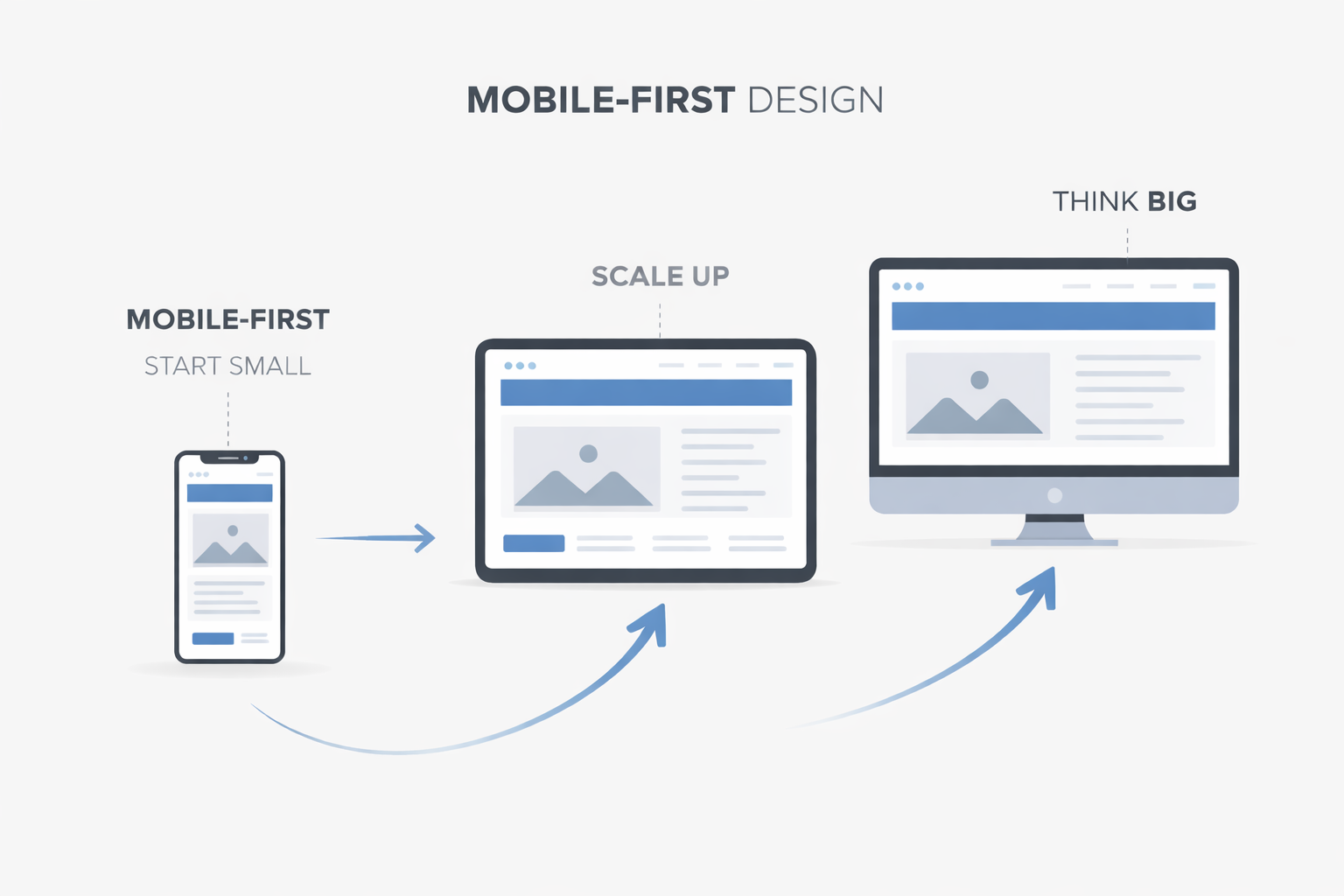
Responsive design, on the other hand, is the technical approach that makes this possible. It uses:
Flexible grids that adjust content to screen size
CSS media queries that rearrange layouts for usability
The same HTML across all devices, ensuring consistency
Google itself recommends responsive web design as the preferred approach for cross-device usability and search performance. emphasizing usability across devices. In other words, mobile-first is the strategy, and responsive design is the technical solution.
A mobile-first approach naturally ensures strong mobile optimization, which includes:
Removing unnecessary elements to improve load speed
Compressing images and streamlining code for mobile networks
Designing navigation for thumb-friendly interaction
At Make My Brand, our UI/UX specialists design responsive, mobile-first interfaces with carefully planned layouts and visual hierarchy to maximize usability and accessibility. Every element, from text size to button placement is intentional, ensuring a smooth and intuitive experience.
Bottom line: Mobile-first design and responsive frameworks work hand-in-hand to deliver a consistent, high-quality experience across devices, keeping users engaged and boosting trust in your brand.
The Business Impact of Mobile-First
The shift to mobile-first design is no longer emerging - it is already here. The numbers make that clear:
65.49% of global web traffic came from mobile devices in 2023.
Around 62.54% of global website traffic was still mobile in 2025.
The global mobile commerce market was valued at USD 2,239.11 billion in 2025, highlighting the massive economic scale of mobile transactions worldwide.
This means most digital interactions - from discovery to purchase - now happen on small screens. Any digital experience that is not designed for mobile is quietly losing attention, trust, and revenue.
Why Mobile-First Drives Revenue?
When mobile experiences are built right, performance follows:
Mobile converts 64% higher than a desktop.
Better mobile UX increases time on site, page depth, and repeat visits
Every slow page load, broken layout, or awkward form on mobile creates friction that directly impacts revenue and brand perception. On the other hand, a smooth mobile experience builds confidence and accelerates decisions.
How Make My Brand Turns Mobile Into a Growth Engine?
At Make My Brand, mobile-first design is not just a framework - it is how digital products are engineered for performance. Our projects consistently deliver higher engagement and stronger conversion rates because they are built around how people actually browse today.
A strong example is our work for a multi-role delivery marketplace, where we created mobile-first, responsive interfaces for both apps and web platforms. Each user group - customers, vendors, drivers, and administrators - received a dedicated, mobile-optimized interface designed for speed, clarity, and usability.
The outcome was a more seamless experience, faster task completion, and a brand that felt modern, efficient, and trustworthy across every touchpoint.
Read the full case study here.
In a mobile-dominated market, experience equals advantage - and mobile-first is how that advantage is built.
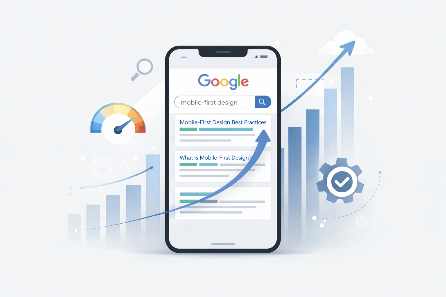
Mobile-First and SEO: Google’s Perspective
Mobile-first design is no longer optional from an SEO standpoint - it is how Google evaluates websites today.
Google now crawls and indexes the mobile version of every website by default, which means rankings are largely based on how well a site performs on smartphones.
What this means in practice:
A visually strong desktop site with a weak mobile experience will struggle to rank.
A fast, mobile-optimized site gains a competitive advantage in search results.
Google clearly states:
“Google uses the mobile version of a site’s content for indexing and ranking. This is called mobile-first indexing.”
This makes mobile-first design a direct ranking factor influencing search visibility.
Why This Matters for Visibility?
When your mobile experience is optimized, it directly improves:
Page speed
Readability and layout
User engagement
Search rankings
These factors signal quality to Google’s algorithms. Faster, cleaner mobile pages reduce bounce rates and increase time on site - two powerful ranking indicators.
The Compounding Effect
Strong mobile SEO creates a growth loop:
Better mobile experience → Higher rankings → More organic traffic → Higher conversions
That is why mobile-first design is not just a UX decision - it is a search performance strategy. When mobile usability, speed, and structure align with Google’s priorities, visibility rises naturally, and so does digital authority.
Making It Happen: Our Mobile-First Approach
At Make My Brand, mobile-first design is embedded into how digital products are engineered for growth.
Our mobile-first design process begins with understanding how users interact discover, evaluate, and act on a brand through their smartphones. From that insight, our teams design interfaces that prioritize speed, clarity, and conversion.
Our delivery model is shaped around three priorities:
Mobile-first architecture that removes friction from core user journeys.
Touch-driven interface design that mirrors how people actually interact with products.
Progressive enhancement that adds depth without sacrificing performance.
This approach is clearly reflected in our work on Teacher Cool, a growing EdTech marketplace built to connect educators and learners.
We reimagined both the teacher and learner experience with:
Mobile-friendly dashboards for courses, assignments, earnings, and communication
Secure, transparent wallets and payments
Responsive learning portals that remove friction at every step
The results were structural and measurable:
40% less admin time for educators through centralized dashboards
35% higher course completion rates driven by intuitive, mobile-optimized learning flows
A stronger, more cohesive brand framework that accelerated adoption across user groups
With these improvements, Teacher Cool emerged as a trusted, scalable platform - proving how a mobile-first strategy drives both user satisfaction and brand credibility.
Conclusion: Building Brands for a Mobile-First World
As user behavior and commerce continue shifting toward smartphones, the quality of your mobile experience directly influences how your brand is perceived, trusted, and chosen.
A strong mobile-first strategy signals that a brand is:
Modern and forward-thinking
Customer-centric by design
Technically credible and reliable
At Make My Brand, this philosophy is embedded into every digital solution we create. By putting mobile-first design experience at the center of design and development, we help organizations future-proof their digital presence while improving engagement, conversion, and brand confidence.
Investing in mobile-first design is an investment in:
Brand credibility
User trust
Long-term growth
It sends a clear message: your brand is ready for how people interact today - and prepared for how they will engage tomorrow.
Don’t let your brand get left behind in a mobile-first world. Work with Make My Brand to create mobile-first experiences that win trust and drive growth.
Loading FAQs
Please wait while we fetch the questions...
Published on February 9, 2026 by Khushpreet Kaur