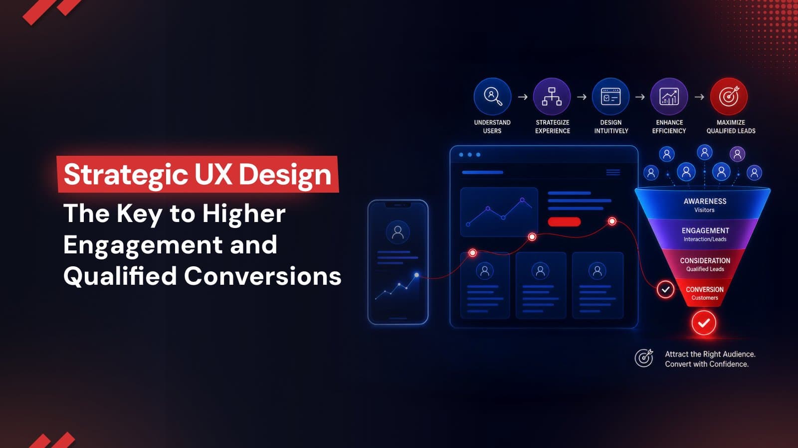
Strategic UX Design: The Key to Higher Engagement and Qualified Conversions
Strategic UX design turns website traffic into qualified conversions by reducing friction, improving mobile experiences, leveraging AI-driven personalization, and optimizing every user interaction. Learn how modern UX strategies help businesses boost engagement, trust, and long-term growth.
In a highly competitive digital marketplace, a website is no longer a static digital placeholder but a dynamic engine for business growth. Organizations invest significant resources to generate traffic to their online channels yet it is only the opening phase of a broader acquisition strategy. Converting that traffic into qualified leads and recurring revenue requires a disciplined, design-led growth strategy.
Strategic UX design bridges the gap between user intent and measurable business actions. When digital interfaces are engineered to align with human psychology, they remove the friction that naturally stifles transactions.
The Evolution of UX - From Visual Appeal to Conversion Performance
To understand how user experience services influence corporate performance, the following table contrasts legacy, aesthetic-focused design practices with modern, conversion-focused web design:
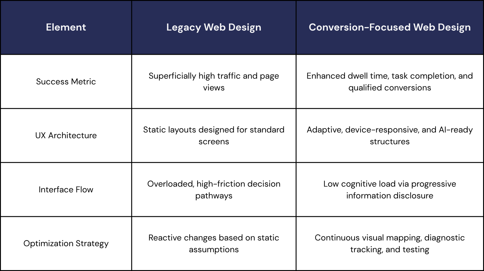
Although current, conversion-focused UX design is defined by these principles, the next step goes beyond human users. Websites must now be designed to deliver seamless experiences for both users and AI-powered search systems.
Predictive UX and Adaptive Website Experiences
Traditional website layouts often force different visitor groups through identical, rigid conversion paths. Modern design-led growth strategies eliminate this limitation by using predictive UX, which applies real-time AI personalization to change the interface dynamically.
By analyzing in-session user behavior such as scrolling speeds, mouse hover patterns, and navigation choices, adaptive interfaces alter page layouts instantly. Instead of waiting for historical profile data, smart algorithms evaluate these quick actions to predict what a user wants right now. Consequently, websites can immediately reorganize content hierarchy, feature highly relevant product categories, and simplify web forms to remove friction and boost sign-ups.
If a visitor displays browsing behaviors associated with operational execution, the layout prioritizes technical checklists and specifications. Conversely, if the system identifies behaviors aligned with strategic decision-making, the page dynamically highlights macro-level outcomes and case studies.
As third-party data tracking systems continue to be phased out, these adaptive systems must be fueled by a transparent first-party data UX. Consent prompts, preference centers, and progressive profile-building widgets all require careful visual design. When these features are intended to be frictionless, they foster confidence and enable users to freely exchange information, resulting in a mutually beneficial relationship.
During the digital and product strategy implementation for the Knowledger educational ecosystem, Make My Brand deployed an adaptive architecture that utilized learner interaction patterns to serve personalized course recommendations. This strategic integration of AI-driven personalization directly reduced user friction, resulting in a 40% faster course completion rate and the successful onboarding of more than 20 academic institutions.
Mobile-First, Strategic UX Design Reduces Visitor Drop-off
A significant point of friction in digital growth is the performance gap between desktop and mobile experiences. While 52.27% of global website traffic now comes from mobile devices, mobile e-commerce conversion rates remain roughly half those of desktop. Closing this gap is essential to protect marketing spend, reduce lead drop-off, and maximize every visitor.
What Mobile-First Approach Requires?
A mobile-first design process treats smaller screens as the starting point not an afterthought. It prioritizes experiences that feel effortless on mobile while strengthening performance across every device.
Design Thumb-Friendly Interactions - Place primary buttons, navigation, and key actions within natural thumb reach to reduce friction and improve usability.
Optimize Core Web Vitals - Improve Largest Contentful Paint (LCP) for faster perceived loading and minimize Cumulative Layout Shift (CLS) to eliminate disruptive page movement.
A faster, smoother, and more intuitive mobile experience that keeps users engaged, reduces abandonment, and turns more mobile traffic into conversions.
At Make My Brand, we blend design clarity and data-driven insights to create seamless, branded experiences. For example, our work with Cars Centro - a mobile first auto marketplace revamped the booking flow with VIN scanning and secure payment features. The result was a frictionless booking path and a modern brand identity that boosted trust and user retention.
UX Best Practices for High-Converting Landing Pages
A landing page exists to convert traffic from a marketing campaign into a targeted action. Every component on the page must serve this single objective. The following table outlines standard landing page friction points alongside strategic, conversion-focused web design solutions:
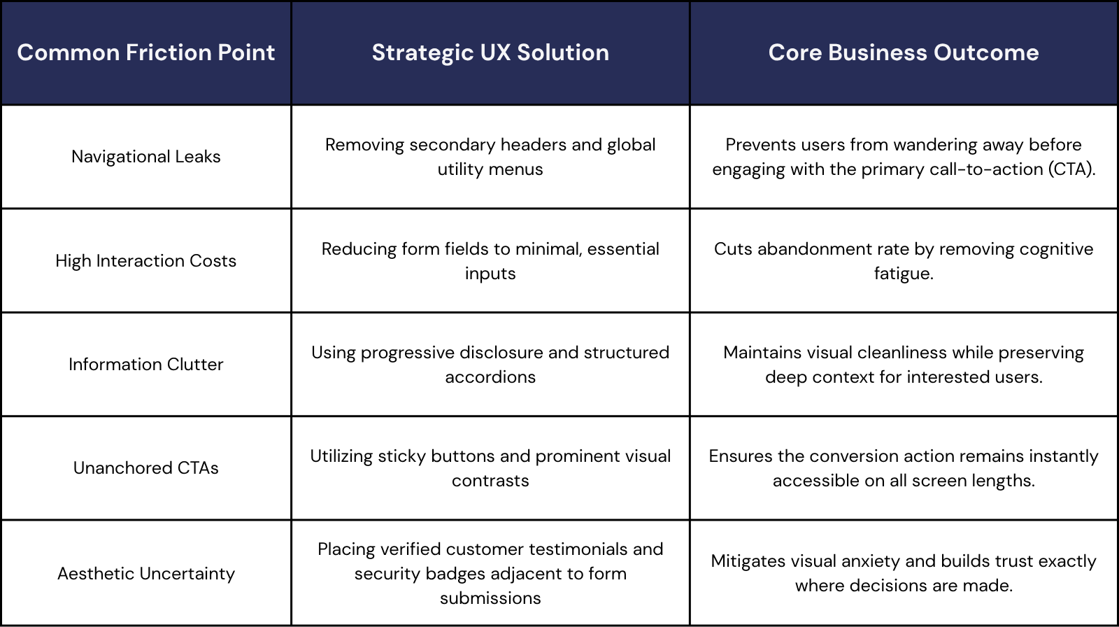
When Teacher Cool sought to transform their educational marketplace, the design strategy applied by Make My Brand focused on building a complete visual system and trusted ecosystem from the ground up. By anchoring clear visual hierarchy, accessible typography, and consistent trust signals across every landing page, the platform successfully translated abstract user interest into trusted, recurring conversions.
Using Heatmaps and Session Recordings to Identify UX Issues
Maximizing conversion performance requires a continuous, diagnostic approach. Instead of relying on pure assumptions, design teams monitor behavior data to pinpoint exactly where visitors encounter friction. Visual analytics like engagement maps and session replays provide clear visibility into these digital roadblocks.
Heatmaps aggregate clicks, moves, and scrolls, showing where users focus and where they ignore critical information. For example, if a heatmap reveals that visitors are consistently clicking a non-interactive visual graphic, it signals that the element needs to be made functional or redesigned to avoid frustration.
Session recordings show real-world user paths. Observing these sessions helps identify "rage clicking" (rapidly clicking on an unresponsive element), circular navigation paths, and hesitation during checkout, pointing to where the layout is confusing.
Analyzing these metrics allows businesses to run calculated tests that systematically target drop-off points. During a major growth initiative for MoogleLabs, Make My Brand paired brand visual refinement with real-time analytics monitoring, capturing over 2,297 user interactions via GA4. This diagnostic approach and continuous performance adjustment generated a 134% increase in organic search sessions and a 235% growth in their user base.
Wireframing and Prototyping in UX
To prevent expensive development reworks, modern digital product design relies on rapid, early validation. Wireframing and prototyping serve as the structural and functional blueprints that de-risk the entire engineering lifecycle.
1. Wireframing - The Logic and Structural Skeleton
A wireframe establishes the fundamental information architecture and content priority without visual distraction. By stripping out brand assets, colors, and typography, these low-fidelity layouts ensure cross-functional alignment remains strictly focused on user flow and interface hierarchy.
The industry has moved past manually mapping out static, fragmented screens. Advanced teams leverage generative AI engines, such as Figma’s native AI utilities or specialized flow tools, to instantly generate adaptive structural layouts based on live design token variables. This shifts the designer’s primary role from execution to critical curation and edge-case stress testing.
2. Prototyping - The Interactive Sandbox
Prototyping transforms static concepts into high-fidelity, interactive models that mirror final application behavior. This phase simulates operational reality, allowing design teams to test user inputs, dynamic states, and complex navigation flows before writing any code.
Current paradigms focus on intent-driven, multimodal prototyping. Designers now build conditional logic that bridges different interaction inputs like voice, touch, and contextual variables directly within the testing environment. Utilizing design-to-code integrations like automated design token pipelines, headless component libraries, or specialized plugin frameworks guarantees that verified, accessible interaction patterns map seamlessly to clean frontend components during developer handoff.
How AI Search Is Changing Website UX Design?
Generative engines are fundamentally reshaping how audiences discover information. Instead of browsing traditional pages of link indexes, users lean heavily on conversational platforms like Google AI Mode, ChatGPT Search, and Perplexity.
Consequently, zero-click behavior has scaled past 77% on mobile displays. Individuals seamlessly gather insights straight from AI-assisted summaries, eliminating the need to click through to a brand website.
This dynamic creates a new priority for technical design. Websites must now be structured for two distinct audiences - human visitors and the machine crawlers that feed generative models. This double-sided optimization strategy, known as Machine Experience (MX) design, ensures that content is structured so AI engines can easily read, parse, and cite it.
Essential Building Blocks for AI-Ready Strategic UX Design
To achieve AI citation readiness and secure visibility within generative answers, specific technical frameworks must be integrated into the website user experience:
Semantic Code Structure
A logically organized HTML document helps AI systems recognize the role and hierarchy of every content block.
Use semantic elements such as <header>, <article>, <section>, and <nav>.
Strengthen machine interpretation by providing clear structural signals across every page.
Entity-First Content Hierarchies
Modern AI search understands topics through entities and the relationships connecting them.
Build content with a consistent H1–H3 hierarchy, descriptive subheadings, and concise paragraphs.
Make information easier for search engines and large language models (LLMs) to interpret, summarize, and reference accurately.
Explicit Schema Markup
Structured data provides additional context that machines cannot reliably infer from visible content alone.
Implement JSON-LD schemas such as Organization, Product, Local Business, and FAQ.
Improve machine readability while increasing eligibility for enhanced search features and AI-powered experiences.
Crawler Accessibility
Even high-quality content delivers limited value if discovery systems cannot access it efficiently.
Maintain valid robots.txt, an up-to-date XML sitemap, and a technically crawlable website.
Help search engines and AI discovery systems locate, process, and index new content with greater efficiency.
Top UI/UX Mistakes That Harm Conversions
Even well-intentioned digital platforms can experience low conversion rates if they overlook structural UX principles. Fixing these top UI/UX mistakes is essential to protecting marketing spend and building a frictionless experience:
Treating Responsiveness as Just Layout
Disregarding Web Accessibility Standards
Forcing Slow JavaScript Executions
Relying on Unstable Page Layouts
Conclusion
Today's websites are expected to do far more than look polished. They need to steer user decisions, eliminate friction, satisfy AI search crawlers, and transform casual attention into measurable business revenue. Every strategic choice - from layout logic and mobile adaptation to predictive personalization and machine-friendly indexing - directly shapes how successfully a brand wins, connects with, and retains buyers. Websites that systematically lower cognitive effort, prioritize mobile-first behaviors, and balance human usability with structured data schemas consistently outpace their market competitors.
Ready to unlock the full potential of your website? Get in touch with our UX experts today.
Loading FAQs
Please wait while we fetch the questions...
Published on July 3, 2026 by Khushpreet Kaur